Why learning Python for data visualization can advance your career

As an IT professional, if you want to take the next leap in your career, the knowledge of Python programming can help a lot. Career prospects are more promising for those who are riding on the present wave of Data Analytics and Machine Learning. Employers are literally chasing those professionals with handsome salaries who have Python featuring prominently in their resumes.
The craze for Python in professional circles is likely to sustain itself. The codes holding immense potential are elegant and can be read easily. If you have already been developing websites, knowledge of Python will help you cut down hours of difficult coding. Python is more concise than PHP and the codes can be reused and scaled. Most complex apps and contemporary websites have codes scripted in Python.
See https:/
Importance of learning Python for data visualization
Learning Python will endear you to top organizations as your skills can be leveraged for data visualization. Through visualization, companies try to gain reliable insights into the latent information in data from the visual context. You can develop dashboards with Python that can reveal correlations, trend lines and patterns which otherwise may not be discernible.
The reasons Python is given prominence for data visualization are many, prominent among which are discussed below.
1. Multiple Powerful Graphing Libraries
For representing critical business data graphically in interactive mode for efficiently conveying insights to managers, the multiple graphing libraries of Python come in handy. A number of powerful features come bundled up with these libraries that allow the display of information in easy to interpret manner. Charts can be customized to render them more efficient and visually pleasing.
Some of the popular Python libraries used for plotting include Matplotlib, Pandas Visualization, Seaborn, ggplot, and Plotly.
2. Complete Freedom to Create Interactive Plots
With Python, you can create data visualization charts in any manner that you desire. The libraries facilitate the building of easy to use, interfaces in default or unique styles. The ggplot library is inspired by the ggplot2 library of R, so if you are proficient in R, you can understand the usage of ggplot effortlessly. With Python training, you can develop your proficiency in data visualization effectively.
3. Ease of Importing Datasets
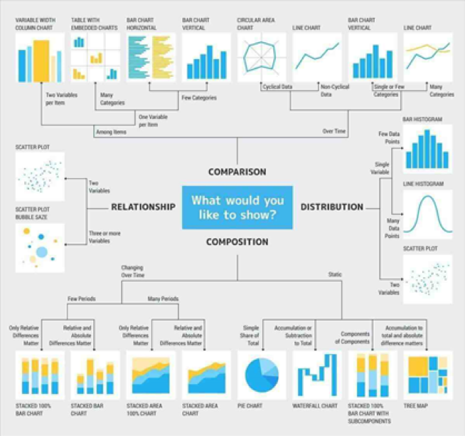
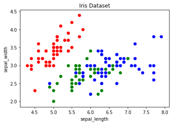
Large and complex datasets can be loaded in visualization interfaces with read_csv and other methods. Some libraries like Matplotlib offers interface similar to Matlab wherein you can code as you like to represent the datasets in the form of meaningful plots. Data can be presented through histograms, line and bar charts, scatter plots etc.
4. Numerous Customization Options
For facilitating elegant visualization, the graphs plotted can be given better meaning with various customization options available. Every data point can be colored based on the respective class. To accomplish this, you have to create a dictionary for mapping from class to color. For example, in a scatter chart, the dictionary can be deployed for coloring each point through a for loop that passes the respective colors.
5. Heatmaps Can Be Created Easily
Heatmaps are preferred by business managers more because trends can be analyzed accurately over a period of time for different parameters. In the heatmap, data is represented graphically by showcasing individual values within a matrix as colors. Python allows the creation of heatmaps for exploration of the correlations among dataset features. The data frame method of Pandas <dataset>.corr() is useful in creating correlation matrix. Both Seaborn and Matplotlib are useful for creating attractive and insightful heatmaps. Annotations can also be added.
6. Faceting Is Permitted
With faceting, you can break data variables across different subplots and then combine them into a consolidated figure. Faceting is highly beneficial in the quick exploration of the dataset. With Python, faceting can be carried out for more meaningful visualization in an easy manner. For example, the ‘FacetGrid’ in Seaborn can be defined and passed on to the data along with row and column in which data would be split. Next, mapfunction is called on the FacetGrid object for defining the plot type you desire to use along with the column in which the graph is to be plotted.
Complete your Python certification without further delay
Data visualization experts are experiencing exponential demand as businesses across the globe are showing keenness to interpret data from all possible perspectives. As such, completing your Python course with expertise in data analytics and visualization would help you land lucrative career opportunities effortlessly. Get a certification from a renowned institute and you are all set to prove your mettle in the booking data science industry.