Dear VSCO, you need to give up on your obsession with minimal design

Call me crazy but the latest update to popular camera app, VSCO, has made it even more complicated to use than ever before. VSCO is an alternative camera app for iOS and Android which has developed a large fan base over the past few years. Many people have praised the app for its “simple” and “minimal” user interface and design choices, but honestly, I never fully understood that praise.
The things I like about VSCO are the various number of filters/settings you can use in the app, as well as its editing abilities. It also seems to utilize the iPhone’s camera better than the default Camera app provided by Apple. That’s why I’ve stuck with it and still have it on my phone, but lately, I’ve actually found myself using Camera+ more often.
The latest update to VSCO, which brings it to version 5.0 on iOS, has introduced new gesture-based UI controls. It is these new gesture-based UI controls that makes the app even more confusing to use than ever before, despite the friendly intro tutorial that appears when you open the app for the first time after the update.
Here, take a look at the new home screen of VSCO. Can you immediately tell me what to do to open the camera? Do I tap on this weird looking lined circle/button thing? Do I swipe right? How about left? Or up? Find the answer below the screenshot.
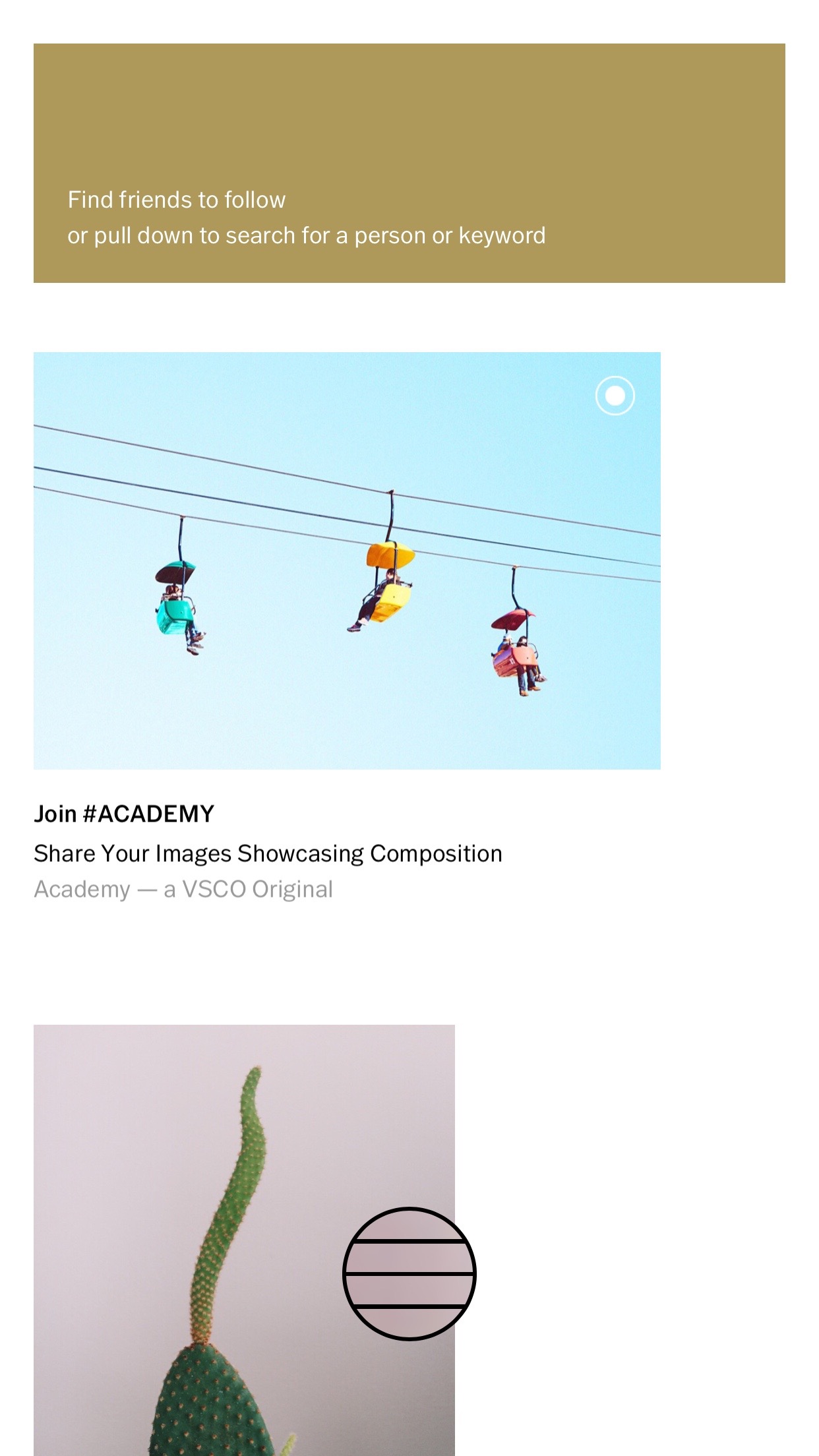
You have to swipe up, but only if you swipe up with your finger touching the weird lined circle/button thing. If you swipe up without having your finger touching that, well, then you scroll down the page. If you try to swipe right or left without touching that circle/button, well, then nothing happens.
So what’s up with the fine folks over at VSCO? I haven’t the slightest clue. They built an amazing camera app but since it’s initial release have insisted on this non-functional minimal design. And while I have a strong inclination this update was supposed to make the app more user friendly, they actually went and did the opposite.
It’s actually a very sad situation because not only is it confusing for new users of the app, but now, it’s confusing again for old users of the app who probably just got the hang of the original user interface only to have it changed. That’s just plain frustrating.
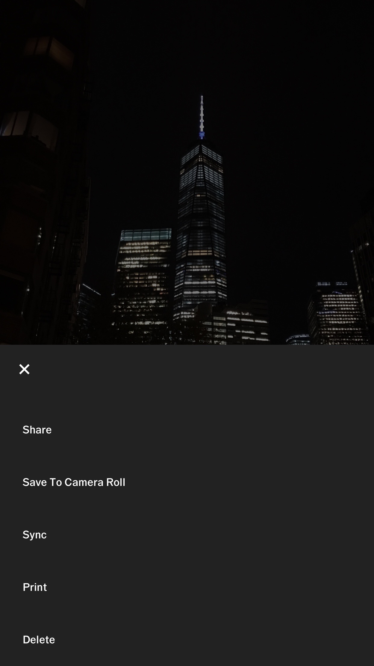
The only interface text (aside from being told to sign up or login) is nestled deep inside a menu when you open your gallery and have a single image in view, you can tap on the “…” button and be presented with the only text options in the entire app (as far as I know). Frankly, that menu is my favorite. Why? Because it’s the only one that I feel confident about what will happen when I tap on an option.
To the VSCO team, your obsession with minimal UX/UI is unhealthy. I don’t know how else to say this, but your design is terrible. When people cannot figure out how to open the camera (the main function of your app) without trying several different options — you have a problem. So please, give up your obsession and build in some practicality into your app’s design or at least go back to the initial design that it seems a majority of your users took the time to figure out despite its insanity.
By the way, I know I’m not alone with my feelings, just take a look at your App Store comments as well as comments on Product Hunt.