How to create high converting landing pages
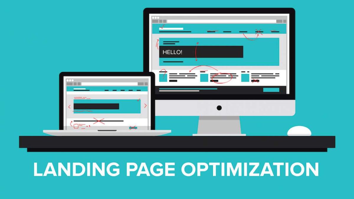
In the long game of holding the attention of the users, creating a compelling landing page is crucial in keeping the audience engaged. It is exactly what happens when you go to a club. You get prepared for the night out by looking great and the bouncer at the door says “sorry, you can’t get in.” In a nutshell, all your investment goes down the drain if the user doesn’t find your landing pages interesting enough.
Why say it is a long game of retaining the attention of users? We know from statistics that sometimes it takes under a minute to flip through a website and press X to close the page. But the user’s journey lasts much longer. It is sometimes generated by a need, in which case the user is really interested to stay on the path to resolve the need. In some cases the journey can last from minutes to hours.
But if user’s attention is captured randomly, us as marketers, need to make an extra-effort to help users stick with us. This is why through some really subtle cues, we need to keep the audience on a smooth track, deliver positive emotions and accompany people to the desired goal.
70% of web traffic is mobile, and texting is the #1 way people communicate.
Susanne Green, Product manager, click-to-text
The landing page is the moment when the audience steps in our territory and we need to do our best to convert that openness of attention into a desire and an intention to achieve the scope that we have established. Sometimes it can be a sale, other times it can be a subscription to a form. After landing on a page, the user gets some supplementary persuading information and they need to perform an action, expressed usually in a very visible area on the landing page.
So how can we create high converting landing pages?
“70% of web traffic is mobile, and texting is the #1 way people communicate,” says Click-to-text Product Manager Susanne Green, but what are the other things to consider? Let’s see, by using some really interesting case studies.
1. Use a mobile-friendly design
First of all, everybody is mobile these days. We are not designing for a single platform, we have to prepare content for multiple formats and screen sizes. In all of them, content must adapt seamlessly.
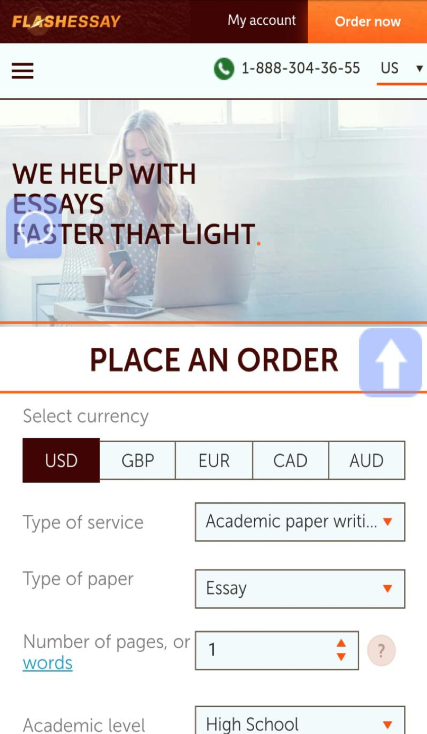
Forget about an abundance of information, just stick to being clear and don’t waste too much of user’s time in order to deliver the message! FlashEssay delivers this on any operating system, either Android or Apple and any size of the screen.
Through design, it is hard to prepare a different layout for all the platforms. Some platforms, such as WordPress, offer templates that are responsive, meaning the pages alter their size and adapt to the screen at hand. Thus they offer a good looking layout that the user can navigate without zooming in or out.
2. Place visibly a clear and catchy call to action
Never forget what you want from your audience. In fact, you must start with stating your objective and put it into a clearly stated sentence. The sentence should be short and the user should understand what they need to do next.
Of course, keep the message focused and try just to ask for one action from the user, as attention might disperse. Make it short and find expressions that speak your audience’s language!
Another thing to keep in mind is to clearly state what is the function of the page you are in, just like you would put labels in a hotel, pointing where the restaurant or the lobby is. As Natalie Andersen, CEO at GetGoodGrade explains: “The call to action should be signaled clearly as buttons or very clearly highlighted areas. The size of the call to action should be bigger than other areas on the page, but not disproportionate. No marketer wants to disturb by “selling too loud.”
3. Give signs of company trustiness through special cues
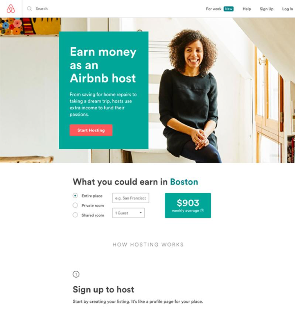
In communications, a lot is given away by more than words. All sorts of visual cues can signal that the company is to be trusted. For example, you have to aim for a general harmony in the design of the landing page like on this example from Airbnb. Look to establish a visibly placed logo and contact means.
Also, in some cases, it is good to read some testimonials on the first page. They really show signs of the company’s trustiness through the eyes of satisfied clients.
I always consider functionality above everything, with respect to the user. I know when you are online, you just want to locate quickly what you need.
Glen thorpe, ux designer, resumescentre
4. Text content can support your promise
As any magazine editor would tell you, you need to organize information in a hierarchy. This actually means giving every bit the importance it deserves and separate titles from subtitles. Use body text to communicate the details and call to action highlighted to convey what the users need to do.
“I always consider functionality above everything, with respect to the user. I know when you are online, you just want to locate quickly what you need. Emphasizing the importance of text through formatting helps a lot. And also, there is another thing. If you can say it shorter, do it. That makes a world of difference,” says Glen Thorpe, an UX designer from ResumesCentre.
Also, consider that sometimes you need to place a sort of Frequently Asked Questions section right on the homepage or landing page. It’s commonly located In the footer of the page, right after the pane that has the main functionality, and gives readers the opportunity to discover the most important info about the site, organized in easily navigable paragraphs.
5. Visual content: an image is worth a thousand words
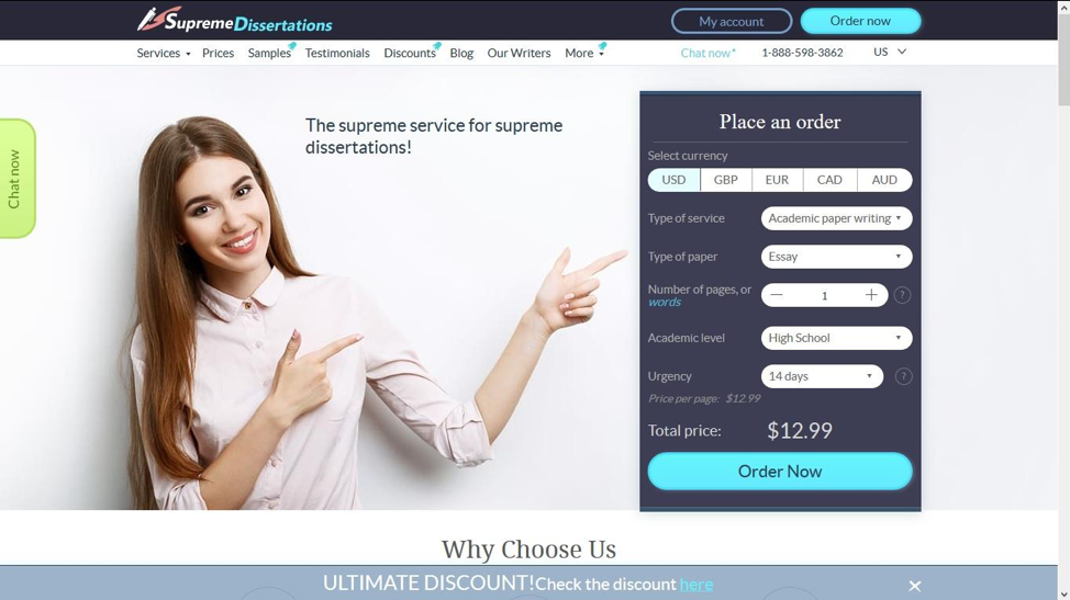
Since we live in a fast paced world, milliseconds are important to catch the attention of the people. Images have the capacity to do just that and to persuade to make the next step. You have to look for pictures that are high-quality, in focus and with a dynamic color palette.
Also, when you use characters, as in the example below from the website SupremeDissertations, look for fresh looking people that also give away positive messages through non-verbal language. What would look attractive in real life, would most likely generate a positive reaction online too.
Also, this is the right time to absolutely consider video as a way to illustrate your message and capture interest. You can easily embed videos from an external source and sometimes, clicking on a video channel can help your audience explore the subject more in depth if you have a rich content to offer.
Electronic media struggles to replace direct contact between people with the means it has. When two people face each other, there is a bigger chance of having a good outcome and attain the objective of selling or subscribing. When online, we use image for that purpose and of course, video format is the best replacement of real life interaction.
6. Testing can make a difference
Very often during the creative stage you end up having several scenarios of usage. Is it better to use a button or directly a form? Does a landing page convert better if it has a video or a splash with a great photo and a headline? Should you display just a product or suggest other similar products in case the user would be disappointed with the initial product, but would find something else interesting.
It is a bit more work on your designers’ side, but you should definitely do some A/B testing prior to rolling a big campaign to see which layout delivers better. Have in mind that you can use this via email marketing with a selected part of your data-base or through targeting a limited audience with ads.
“You can even test with real people and see how long it takes for them to understand what the proposal is all about. You can also ask questions about what the layout expresses in their eyes. This way you may get some qualitative input and later adapt the design,” explains Jessica Fender, chief content officer at OnlineWritersRating.
Final thoughts
When creating pages, always see yourself in the shoes of the user and don’t do anything you wouldn’t personally like to see. Even if you read a lot of marketing tutorials, the best judge of what you achieve will be given by people who don’t know marketing.
If the information is delivered seamlessly, you won’t get necessarily reviews about your great design. You will have the sales numbers as a testimony of the good design that you have made.
As they say, good design is not visible, it just makes things intuitive and easy to use. So here is in a nutshell, what you need to do:
- Be in touch with how people use the media, especially if it is on the go, as everybody owns a mobile device.
- Express clearly what the users need to do through a catchy call to action. Have all the information needed in handy.
- Don’t be too redundant and use short words and as little as possible.
- Put extra importance on the images you choose and favor video.
- And at the end, test it out. Show it around to people you know or even better, test with a small portion of the database.
Now go rock on your best landing pages!