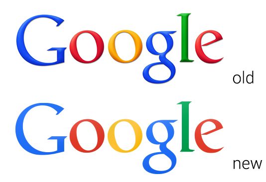
Is This Google's New Logo? It Looks Flat.

Flat UI’s are all the craze lately, which is why it was super interesting when ArsTechnica noticed something different while poking around the Chrome Beta for Android APK. A potentially new Google logo. While the logo is certainly not a huge change, it does take out all of the harsh gradients and switch over to lighter shades of each primary color, giving it a much more flat look.
Take a look for yourself at the above image.
This hasn’t been finalized yet, and it may never be. That being said, even if it were finalized, how often would we see it? It seems like every day Google has a new doodle on its home page. In the words of our own Shawn Farner, “I think the doodler got more freedom to do almost anything, which is kind of cool. I always end up learning about something I wasn’t familiar with when they do some 15th century painter.”
Update: Well that was a short-lived rumor. A person familiar with Google’s branding told The Verge that this is not a replacement for the company’s traditional logo. Instead, the flatter design is used in instances where the beveled logo may not display well — such as on printed banners or other corporate use cases. The logo in question has been already pulled from where it first appeared in the latest Chrome for Android beta, signaling that the company quickly realized its mistake. Suffice it to say, the Google logo you know and love isn’t going anywhere anytime soon.
Update 2: Looks like The Verge may have been wrong. See our latest post.
