The dark side of UX: Dark Patterns are how companies keep users engaged

When it comes to modern online business, most consumers will be familiar with the term user experience, which encompasses the collective aspects of the end-user’s interaction with a business and its products. Companies who invest in UX often see a lower cost of customer acquisition, increased customer retention, and expansion into new demographics and markets.
However, consumers might not know about components of the user experience called dark patterns — even though they’ve undoubtedly encountered them while browsing on their favorite websites. UX designer and consultant Harry Brignull officially coined the term “dark patterns” in 2010, so the concept has been around for a while.
What Are Dark Patterns?
Dark patterns are design decisions or other content choices that convince people to sign up for things they otherwise wouldn’t want, or consent to some of the least-restrictive privacy settings a site offers. Some also try to steer users’ behaviors in other ways when they’re online — all to benefit the companies that use this kind of trickery.
Word and tone choices can also factor into dark patterns. For example, when a person reads a description of the data-sharing settings for a site, the site could choose to downplay risks associated with the ones that provide a site owner with the most information. In other cases, people could see seemingly innocent phrases such as “Just click here to confirm your privacy choices and continue reading the article.”
Let’s look closer at some of the various types of dark patterns.
Most People Don’t Read the Fine Print
Studies confirm people don’t like to read the tiny lines of text that accompany user agreements and other relevant documents that dictate what websites can do with the information individuals provide. Some dark patterns play into that reality. They have large, brightly colored buttons for people to press to indicate their consent.
The options for those who decide not to sign up for something are often much harder to see. They might be in minuscule, gray font, or nestled into the bottom corner of a dialog box, nearly blending in with the main background hue.
So, keeping in mind people usually don’t have the patience to read long paragraphs of text filled with legal jargon and hard-to-understand specifics, dark patterns entice people to get past those paragraphs as quickly as possible — agreeing to the least restrictive privacy options in the process.
Your Options May Not Be Clearly Defined
While visiting a website, you may see a popup box that asks you to set your desired cookie settings or something else just as specific. Moreover, one of the choices may say “(Recommended)” next to it, while the others are impossibly vague, and none have descriptions associated with them.
Some of the most tech-savvy people might do Google searches to learn more about all the presented choices. However, individuals frequently do the most straightforward thing and blindly click the “recommended” possibility without knowing what it means.
Limited information coerces people into buying things they don’t need, too. If a company advertises a product tier as “most popular,” people swiftly assume it’s the best choice. TurboTax exaggerates the benefits of their paid features and isn’t clear enough about how much some of them cost. Because doing taxes intimidates many individuals, they may think paying for a service makes it better, instead of doing further research to make sure that’s true.
Or, people may initially only see “I Agree” buttons when pop-up boxes appear on their screens. That’s often because the options to opt out are under drop-down menus that only become visible if people click tiny arrows. In the worst cases, people don’t see anything but a button that confirms consent. Then, the only way to avoid giving in is to navigate away from the site.
Your Friends Might Get Spam From Your Actions
Dark patterns are deceptive for the ways they suggest increased convenience. For example, one commonly seen type encourages you to see which of your friends are already using an app you just downloaded. The implication is that by providing access to your friends list, there’s no need to spend time manually searching for familiar faces. You can just let the site pull data about your contacts, and thereby customize your interactions with the site.
But, the trade-off for saving time is often that people you know get spammed by the site — because you provided access to a list of contacts.
Some Dark Patterns Discourage Account Deletion or Unsubscribing
Many of the dark patterns discussed so far work by convincing people to give up as much information about themselves — or their friends — as possible to continue using sites. However, another misleading design trick is called a “roach motel.” It makes it extremely easy to create a site account, but prohibitively difficult to delete one.
Amazon is one brand that uses the tactic. When people want to close their accounts, they find it’s not evident how to do it. The process involves too many choices, and none that explicitly allow deleting an account.
Plus, even if people figure out how to delete their accounts, they find it’s not possible to do it independently. Instead, they have to ask a customer service representative to take care of the request. The problem is that human interaction provides an opportunity for the service representative to convince people not to delete their account after all.
When Facebook users had to update their privacy preferences to comply with GDPR regulations, the option for deleting their accounts was similarly hard to find. It wasn’t even a button, but a tiny link that said: “I’m ready to delete my account.” Moreover, it wasn’t viewable until after people scrolled past large blocks of text. Even Google is not above using dark patterns to influence users’ actions.
Some email newsletters make people fill out lengthy questionnaires about why they want to unsubscribe from lists, too. Rather than going through the hassles, some frustrated individuals give up and keep their subscriptions. Alternatively, the unsubscribe links are intentionally hard to see due to being buried in the footer.
Awareness Leads to Avoidance
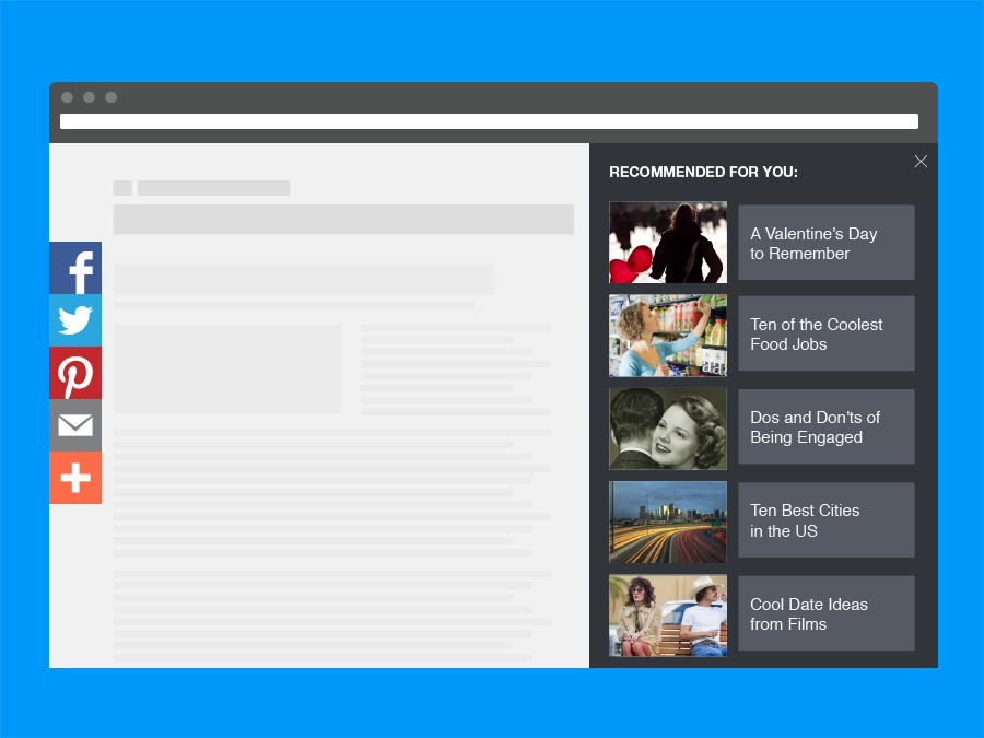
The examples described above are some of the most common dark patterns, but they’re not the only ones. Others use color, confusing options, non-intuitive slider buttons and more. You might also find dark patterns in your inbox as ads appearing almost like legitimate emails. There are even dark patterns with advertisements that seem to have specks of dirt or stray hairs on them, encouraging people to clean their device screens and tap the ads at the same time.
However, now you’re aware of what dark patterns are and how they could taint your online experiences. Looking for and recognizing dark patterns on every site you visit makes you less likely to fall for the traps. You may want to publish screenshots of the various techniques on social media to make others more aware of them, too.