YouTube Pushes Out New Redesign, Puts Emphasis on Playlists

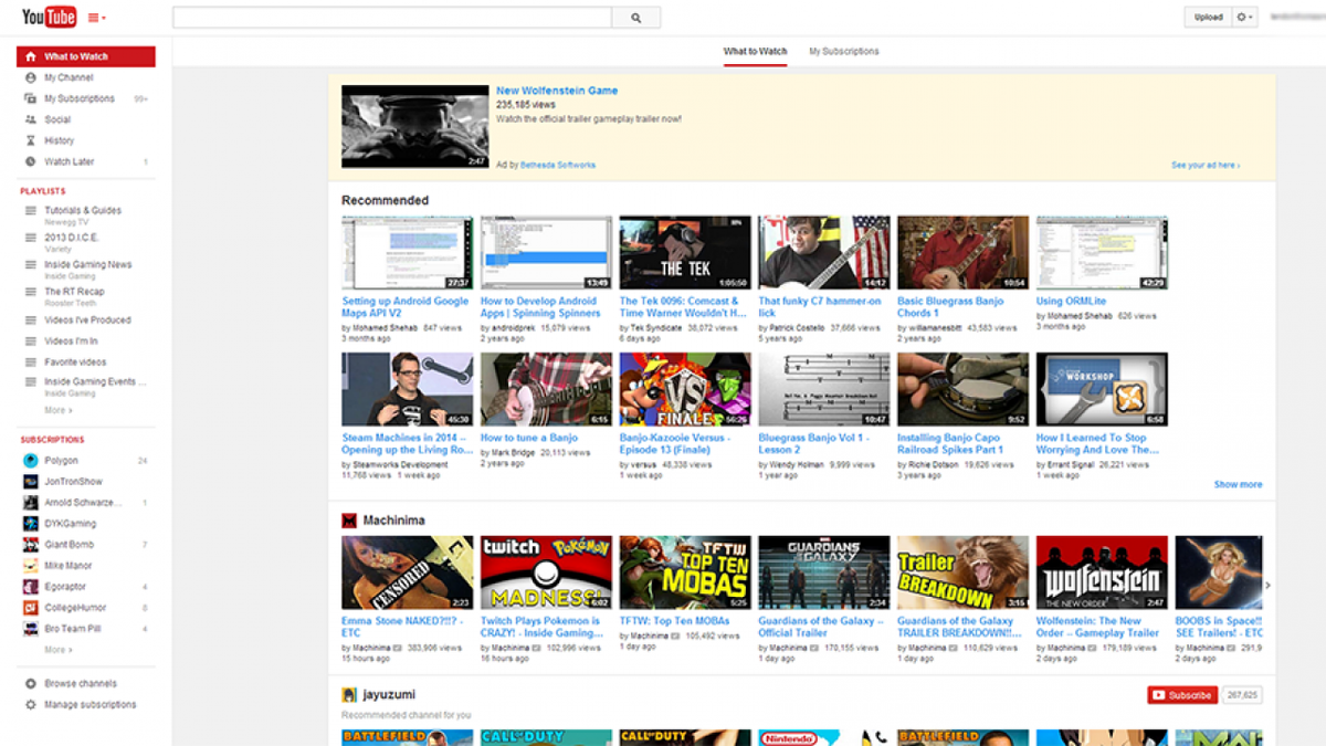
YouTube, following tradition, is rolling out yet another site redesign to users. In this update, which should be visible to most users today, is more stream-lined to fit users’ tastes, and puts a more hefty emphasis on playlists.
Your main front page will showcase the familiar “What to Watch” tab, which contains recommended videos you haven’t seen yet, popular videos from your subscriptions, and newly recommended channels that might fit your interests.
The front page also has simple access to your subscriptions through a “My Subscriptions” tab. This gives you one giant scrolling list of all the videos the channels you follow have uploaded. It’s sort of inelegant in that way, but you can’t say they’re not delivering you the content you’re after.
And potentially the biggest change that users have been requesting has been granted, as the site is now entirely center-aligned once more. For nearly a year now, the site has been left-justified, leaving video pages with an abundance of white space that the site never really put to use. In a discussion with TechCrunch, Google says this decision was made to give the site a “feeling similar to the mobile apps you’re spending almost half your YouTube time with.”
The persistent sidebar now has a few new icons, which house playlists, subscriptions, and anything else you might need quick access to while perusing content on YouTube. The site’s typography has also received a facelift, making it all the more readable.
You can learn more about these changes over on YouTube’s blog, and you can express how much you love or hate the new design in the comments below.
